

 Paris Saint-Germain, the French Club who recently has Beckham has come out with a new Logo claiming to brand their team and emphasising it’s existence in Paris.
The new logo is said to be used for the 2013 – 2014 season
The clubs logo has now been changed for the 7th time since 1970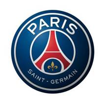
1970 – 1972
1972 – 1982 and 1990 – 1992
1982 – 1990
1992 – 1996
1996 – 2002
2002 – 2013
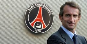
Jean-Claude Blanc, the delegated general director of the club, explained Friday morning in press conference that with this new stage the PSG “did not disallow fundamental of the club”. “One is in a large European club with symbols which represent it.
It is not a great rupture but the simplification of the symbols. This logo is the expression of our new strategy with the construction of a world brand of sport “. The person in charge also with also expressed himself on the town of Saint-Germain-in-Bush hammer (Yvelines) historically dependent with the club of the capital.
“No moment one thought of removing Saint-Germain, but one wished to emphasize Paris much more. Two elements disappear: the pram, because much of people have difficulty understanding its significance and the reference to the creation of the club in 1970”.
The new version is however in the shape of a circle, with the tower Eiffel in its center. The three colors red, blue and white are present as usual, just as the flower of lily and the name  having Paris alone at the top and Saint – Germain below in the oval shaped logo.
The blue is dominant and has a little tone which is a little bit clearer than the current logo. The cradle and the founding date 1970 are absent.
Read also:
http://en.africatopsports.com/2013/02/22/ligue-1-andre-dede-ayew-believes-his-side-will-defeat-psg/
http://en.africatopsports.com/2013/02/14/basile-boli-i-have-seen-right-for-psg/
http://en.africatopsports.com/2013/02/11/psg-championship-folded-lyon-and-marseille-on-the-street/